
Dynamically Add or Remove Measures from Visual
- Maciek Lasota
- Oct 7, 2021
- 1 min read
Another tip to declutter your Power BI report,
In one of the previous posts, I wrote how to use slicers for dynamic measure change on your chart . The disadvantage of the method present is that you can choose only one measure at a time.
This is the next level you can actually create a slicer that allows you to chose few metrics on one page. Here we go step by step
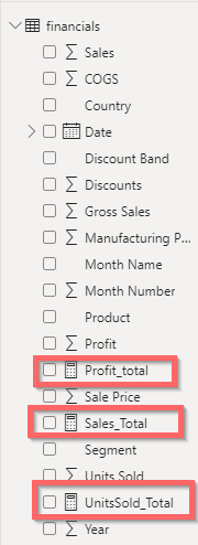
Step1.At Start we have 3 measures in Finance original table that we created already in the previous post:
Step2 Now we create a Navigation table and we input names of our measures (in my case there are 3 but you can go with more) :

Step 3. Then we need to create another set of measures in the Navigation Table for each of them, In code, we refer to original measures from step 1.

Here is the code:
ProfitTotal = var logictest = COUNTROWS(DISTINCT( FILTER( ALLSELECTED(Navi[Selection]), Navi[Selection]="Profit_Total") ))=1 Return IF ( logictest, [Profit_Total],BLANK())
We do this for all measures we want to show in this case for 3 so the navigation table looks like this:

Now we can put it all one dashboard:
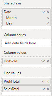
Create a Line chart with Date on X-axis and 3 measures on Y I use one as columns and 2 as line values:
2 We create slicer with Selection from Navi Table:

3 What we now have is a line/bar chart with Slicer that allows us to choose our measure:

This is a great solution for creating a flexible chart without cluttering it with too many variables. Do you use this or similar PowerBI hacks?

Comentarios