


How to declutter your PowerBI report
- Maciek Lasota

- Dec 17, 2020
- 2 min read
Updated: Mar 8, 2021
Quick guide to slicers for dynamic measure change.

If you have a large number of measures in your report and you are running out of space this can be very helpful to clean up your report. Instead of showing a separate chart for all of your measures and cluttering your report just use SWITCH() to create a slicer that will adjust what users see on one or more charts.
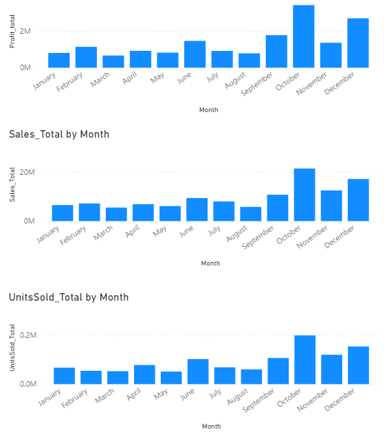
It's a common occurrence to see reports like the below where we see similar charts all in one report. It sometimes makes sense, but it does take up quite a bit of room.
What if we want to cut on space and dynamically flick over measures with slicer like on screen below:

In our use case we want to go from 3 separate charts to one that user can interact with, here`s how to implement this:
Step 0. Create your measures
First, we need to create a basic measure so we have something to work on.
You probably already have your measures but for this example, I used the PowerBI sample financials dataset and created three basic measures so we have something to work on.
UnitsSold_Total = sum(financials[Units Sold])
Sales_Total = sum(financials[ Sales])
Profit_total = sum(financials[Profit])


Step 1. Create Measures Table :
You need to create a table with names of measures you want to show, the index can be added for sorting purposes. We use Enter Data:

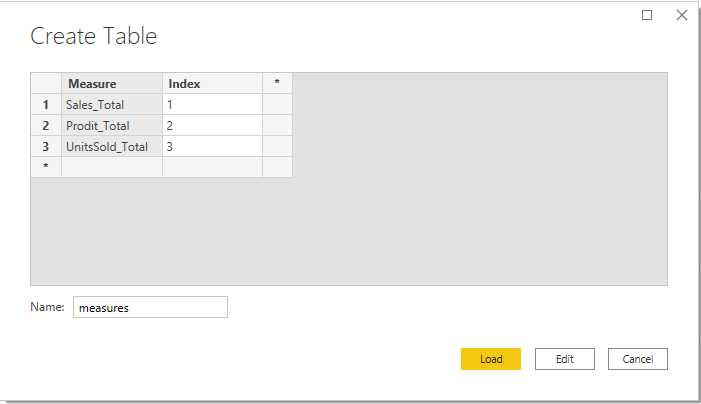
Make sure the created table doesn`t have any relations in your data model.
Step 2. Implement the switch function:
Create Measure_Select with SWITCH() function, using SELECTEDVALUE() specify measure table and provide your measures as arguments (in this case we provide 3 measures from Step 0 :

Step 3. Put it into work on the dashboard:
- Create a slicer with Measure name as Values
- Create a chart with Measure_Select as Values from step2 as values and any other dimension you want to see I just added date.

Then in the option set up a single select property for slicer and you're good to go.
This technique can open up some possibilities and here are my two recent examples:
Use Case 1:
If you duplicate the measure table and do some naming adjustments (just rename measure to measure2) you can have a real clear scatter plot when you can choose out of your measures :

In this case, I`m comparing Profit vs Units Sold but you can be very creative with this especially when you have few measures
Use Case 2:
It can be very handy on decomposition tree which consumes a lot of space:

Stay tuned and subscribe at the bottom or follow me on Twitter.

Comments